
The IRS publishes many interesting datasets derived from our filings. When we file the tax return (Form 1040,) we need to fill out the address. Yep, the IRS uses the data to estimate the yearly migration. Let’s assume we have the following data points for 2014, and 2015 filings:
|
1 2 3 4 5 6 |
##### Examples ##### Example <- data.frame(ID = c('999','999'), Tax_Year = c(2014, 2015), State = c('HI', 'WA')) Example |
|
1 2 3 4 |
> Example ID Tax_Year State 1 999 2014 HI 2 999 2015 WA |
We can see that one person left Hawaii to Washington: +1 for Washington and -1 for Hawaii. Yep, the IRS has the tax filers’ address, and they did just that to millions of tax filers. The best thing about this is that they published their finding way back to 1990 at this site.
So, we will take a look at the State of Washington migration data from 2011 to 2014. But before that, as usual, we need to load libraries and set up the theme.
|
1 2 3 4 5 6 7 8 9 10 11 12 13 14 15 16 17 |
##### Load Goodies ##### library(tidyverse) library(readxl) library(fiftystater) ##### Create Theme for GGPLOT2 ##### theme_moma <- function(base_size = 12, base_family = "Helvetica") { theme( plot.background = element_rect(fill = "#F7F6ED"), legend.key = element_rect(fill = "#F7F6ED"), legend.background = element_rect(fill = "#F7F6ED"), panel.background = element_rect(fill = "#F7F6ED"), panel.border = element_rect(colour = "black", fill = NA, linetype = "dashed"), panel.grid.minor = element_line(colour = "#7F7F7F", linetype = "dotted"), panel.grid.major = element_line(colour = "#7F7F7F", linetype = "dotted") ) } |
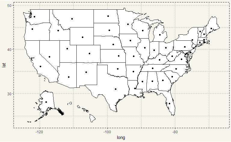
But before we deal with IRS data, I’d like to get the mapping done first.
Inkplant.com published associated latitude and longitude in each State here. I then put that in an Excel format, and imported to the environment.
|
1 2 3 4 5 6 7 8 9 10 |
##### Load Data ##### zip <- read_excel('Zip.xlsx') data("fifty_states") geom_map(map = fifty_states) ##### Nope ##### ggplot() + geom_polygon(data = fifty_states, aes(x=long, y = lat, group = group), fill = 'white', color = 'black') + coord_fixed(1.3) + geom_point(data = zip, aes(x = Long, y = Lat)) + theme_moma() |

Well, that doesn’t look good. The author of a fiftystater package moved Alaska and Hawaii to be under California. Therefore, we need to change their coordinates.
|
1 2 3 4 5 6 7 8 9 10 11 12 |
##### Alaska and Hawaii Coordinates ##### zip$Long <- as.character(zip$Long) zip$Lat <- as.character(zip$Lat) zip$Long <- plyr::revalue(zip$Long, c("-152.404419" = "-118.00010", "-157.498337" = "-106.00010")) zip$Lat <- plyr::revalue(zip$Lat, c("61.370716" = "28.10000", "21.094318" = "26.10000")) zip$Long <- as.numeric(zip$Long) zip$Lat <- as.numeric(zip$Lat) |
That’s much better. We are done with the mapping. Next, IRS published the data (link) in a CSV format separate into inflow and outflow. Therefore we need to load eight files to R.
|
1 2 3 4 5 6 7 8 9 10 11 12 13 14 15 16 17 18 19 |
##### Load Files ##### file <- c('1112wa', '1213wa', '1314wa', '1415wa') year <- c('11','12','13','14') type <- c('Inflow','Outflow') for (i in 1:1){ for (j in 1:length(file)){ path <- paste(file[j],'xls',sep ='.') sheet <- paste('State', type[1], sep = ' ') assign(paste(type[1], year[j], sep='_'),read_excel(path = path, sheet = sheet)) sheet <- paste('State', type[2], sep = ' ') assign(paste(type[2], year[j], sep='_'),read_excel(path = path, sheet = sheet)) } rm(file, year, type, i, j, path, sheet) } |
After running the for loop() , there should be eight data frames in the environment.
|
1 2 |
##### First Look ##### glimpse(Inflow_11) |
|
1 2 3 4 5 6 7 8 9 10 |
> glimpse(Inflow_11) Observations: 62 Variables: 7 $ `WASHINGTON INFLOW` <chr> "Individual Income Tax Returns: State-to-State Migration Inflow for Selected ... $ X__1 <chr> NA, NA, "Origin from", "State Code", NA, "96", "97", "98", "53", "6", "41", "... $ X__2 <chr> NA, NA, NA, "State", NA, "WA", "WA", "WA", "WA", "CA", "OR", "TX", "FL", "AZ"... $ X__3 <chr> NA, NA, NA, "State Name", NA, "WA Total Migration US and Foreign", "WA Total ... $ X__4 <chr> NA, NA, "Number of returns", NA, "-1", "98392", "94459", "3933", "2489215", "... $ X__5 <chr> NA, NA, "Number of exemptions", NA, "-2", "188705", "180278", "8427", "542756... $ X__6 <chr> NA, NA, "Adjusted gross income (AGI)", NA, "-3", "5412599", "5190092", "22250... |
Unfortunately, IRS published the structure of data is appropriate for viewing in Excel. Therefore we need to wrangle with the data.
|
1 2 3 4 5 6 7 8 9 10 11 12 13 |
##### Processing ##### Inflow_11 <- Inflow_11[6:60,] Inflow_12 <- Inflow_12[6:60,] Outflow_11 <- Outflow_11[6:60,] Outflow_12 <- Outflow_12[6:60,] Inflow_13 <- Inflow_13[6:61,] Inflow_14 <- Inflow_14[6:61,] Outflow_13 <- Outflow_13[6:61,] Outflow_14 <- Outflow_14[6:61,] ##### Better? ##### glimpse(Inflow_11) |
|
1 2 3 4 5 6 7 8 9 10 |
> glimpse(Inflow_11) Observations: 55 Variables: 7 $ `WASHINGTON INFLOW` <chr> "53", "53", "53", "53", "53", "53", "53", "53", "53", "53", "53", "53", "53",... $ X__1 <chr> "96", "97", "98", "53", "6", "41", "48", "12", "4", "16", "57", "8", "36", "3... $ X__2 <chr> "WA", "WA", "WA", "WA", "CA", "OR", "TX", "FL", "AZ", "ID", "FR", "CO", "NY",... $ X__3 <chr> "WA Total Migration US and Foreign", "WA Total Migration US", "WA Total Migra... $ X__4 <chr> "98392", "94459", "3933", "2489215", "17062", "11902", "5945", "5651", "4438"... $ X__5 <chr> "188705", "180278", "8427", "5427563", "33005", "22977", "12482", "8764", "83... $ X__6 <chr> "5412599", "5190092", "222507", "176111406", "1111687", "579181", "325106", "... |
Okay. The unwanted rows are gone. Still, the format is far from good. Since we have eight files which require the same wrangling tasks, I’ll write a function to perform the tasks.
|
1 2 3 4 5 6 7 8 9 10 11 12 13 14 15 16 17 18 19 20 21 22 23 24 25 26 27 28 29 |
##### Function ##### func_work <- function(df, type, year){ colnames(df) <- c("FIPS_To", "FIPS_From", "Abb_From", "State_From", "No_of_Return", "No_of_Exemptions", "AGI") df$Type <- paste(type) df$Year <- as.numeric(paste(year)) df$No_of_Return <- as.numeric(df$No_of_Return) df$No_of_Exemptions <- as.numeric(df$No_of_Exemptions) df$AGI <- as.numeric(df$AGI) df <- left_join(df, zip, by = c("Abb_From" = "State Abbreviation")) df$LatTo <- (47.40090) df$LongTo <- (-121.49049) df <- mutate(df, Long = ifelse(is.na(Long) == TRUE, -70,Long)) df <- mutate(df, Lat = ifelse(is.na(Lat) == TRUE, 27.76628, Lat)) df } Inflow_11 <- func_work(Inflow_11, 'Inflow', '2011') Inflow_12 <- func_work(Inflow_12, 'Inflow', '2012') Inflow_13 <- func_work(Inflow_13, 'Inflow', '2013') Inflow_14 <- func_work(Inflow_14, 'Inflow', '2014') Outflow_11 <- func_work(Outflow_11, 'Outflow', '2011') Outflow_12 <- func_work(Outflow_12, 'Outflow', '2012') Outflow_13 <- func_work(Outflow_13, 'Outflow', '2013') Outflow_14 <- func_work(Outflow_14, 'Outflow', '2014') |
Next, we aggregate the data.
|
1 2 3 |
##### Aggregate ##### Inflow <- rbind(Inflow_11, Inflow_12, Inflow_13, Inflow_14) Outflow <- rbind(Outflow_11, Outflow_12, Outflow_13, Outflow_14) |
We are ready to plot the charts.
|
1 2 3 4 5 6 7 8 9 10 11 12 13 |
##### Inflow ##### Inflow %>% filter(Abb_From != 'WA') %>% group_by(State_From) %>% mutate(Net = sum(No_of_Return)) %>% ggplot() + geom_polygon(data = fifty_states, aes(x=long, y = lat, group = group), fill = '#F7F6ED', col = 'black') + coord_fixed(2.5) + geom_point(aes(x = Long, y = Lat, size = No_of_Return, col = State), alpha = 0.5) + scale_size_continuous(range=c(1,30)) + coord_cartesian() + theme_moma() + theme(legend.position = "none") |
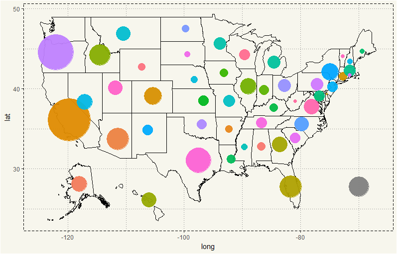
It seems like people move from California and Oregon to Washington the most. The grey circle at lower right corner represent foreign migrants which IRS doesn’t specify the country of origin. So I just put them at the edge. What about outflow?
|
1 2 3 4 5 6 7 8 9 10 11 12 13 14 15 16 17 18 19 |
##### Outflow ##### Outflow %>% filter(Abb_From != 'WA') %>% group_by(State_From) %>% mutate(Net = sum(No_of_Return)) %>% ggplot() + geom_polygon(data = fifty_states, aes(x=long, y = lat, group = group), fill = '#F7F6ED', col = 'black') + coord_fixed(2.5) + geom_point(aes(x = Long, y = Lat, size = Net, col = State), alpha = 0.5) + geom_curve(aes(x = LongTo, y = LatTo, xend = Long, yend = Lat), arrow = arrow(angle = 15, ends = "last", length = unit(0.2, "cm"), type = "closed"), size = 1, alpha = 0.1, curvature = 0.15, inherit.aes = TRUE) + scale_size_continuous(range=c(1,30)) + coord_cartesian() + theme_moma() + theme(legend.position = "none") |

Hm, putting the arrows in look quite fancy. But I’d think it is quite harder to look. Nevertheless, we need better visualization. I feel like the numbers of inflow and outflow are, in fact, about the same. Let’s visualization again but this time with net migration.
Initially, the IRS sort the data by Number of Return. So, we cannot just merely subtract Inflow with Outflow. For example, if California has the highest inflow, it then will be the first entry. But if Oregon has the highest outflow, we cannot subtract them.
First, let’s sort them.
|
1 2 3 |
##### Sorting ##### Inflow <- arrange(Inflow, State_From) Outflow <- arrange(Outflow,State_From) |
Although we don’t have any new State in the past ten years, I still want to make sure that there is no error. So, let’s do this.
|
1 2 3 4 5 6 7 8 9 10 |
##### check ##### check <- cbind(Inflow$State_From, Inflow$Year, Outflow$State_From, Outflow$Year) check <- data.frame(check, stringsAsFactors = FALSE) ##### Concatenate ##### check <- mutate(check, inflow = paste(X1,X2)) check <- mutate(check, outflow = paste(X3,X4)) ##### Check ##### table(check$inflow == check$outflow) |
|
1 2 3 4 |
> table(check$inflow == check$outflow) TRUE 222 |
All 222 observations’ State and Year matched perfectly. So, we can just merely subtract them in a new dataset.
|
1 2 3 4 5 |
##### Net Migration ##### net <- select(Inflow, State_From, Abb_From, State, No_of_Return, Year, Long, Lat, LatTo, LongTo) net <- cbind(net,Out_No_of_Return = Outflow$No_of_Return) net <- mutate(net, Net_Migration = No_of_Return - Out_No_of_Return) |
Alright, let’s see the net migration.
|
1 2 3 4 5 6 7 8 9 10 11 12 13 14 |
##### Net Migration ##### net %>% filter(Abb_From != 'WA') %>% group_by(State_From) %>% mutate(Net = sum(Net_Migration)) %>% mutate(Type = ifelse(Net > 0, "Surplus", "Deficit")) %>% ggplot() + geom_polygon(data = fifty_states, aes(x=long, y = lat, group = group), fill = '#F7F6ED', col = 'black') + coord_fixed(2.5) + geom_point(aes(x = Long, y = Lat, size = Net, col = Type), alpha = 0.1) + scale_size_continuous(range=c(1,30)) + coord_cartesian() + theme_moma() + theme(legend.position = "bottom") |

It seems like Washington State has a surplus migration from almost every State except North Dakota, South Dakota, and Idaho. Also, there is a slight deficit in foreigner category.
Well, I am a bit surprised. Amazon, Microsoft, Costco, and Starbucks have headquarters/campuses. So I wouldn’t be surprised if they will attract talents and have a net surplus. But South Dakota? Why would Washingtonians move to South Dakota? Is it the shale boom? We may have some more info if we take a look at a times series plot.
|
1 2 3 4 5 6 7 8 9 |
##### SD, ND, and ID ##### net %>% filter(Abb_From %in% c('SD','ND','ID')) %>% group_by(State_From) %>% ggplot(aes(x= Year, y = Net_Migration, group = State_From)) + geom_line(aes(col = Abb_From), size = 1.5, alpha = 0.5) + geom_point() + theme_moma() + labs(col = "State") + theme(legend.position = 'bottom') |

Oh, things have improved. In 2011, Washington State had the net deficit with the three States. But it gradually decreased over the years. Idaho’s net deficit is the most notable as the Net_Migration has steeply increased in 2013 and 2014. Let’s compare the actual inflow and outflow for greater detail.
|
1 2 3 4 5 6 7 8 9 10 |
##### SD, ND, and ID 2 ##### rbind(Inflow, Outflow) %>% filter(Abb_From %in% c('SD','ND','ID')) %>% ggplot(aes(x= Year, y = No_of_Return, group = Type)) + geom_line(aes(col = Type), size = 1.5, alpha = 0.5) + geom_point() + theme_moma() + guides(col = guide_legend(reverse = TRUE)) + facet_wrap(~State_From) + theme(legend.position = 'bottom') |

All three States exhibit a downward trend on both Inflow and Outflow. But the downward trend is strong in Idaho in which in 2013 and 2014, the Outflow dropped below Inflow.
TL;DR From 2011 to 2014, the State of Washington can attract Americans more than it drives away. However, after summing the inflow and outflow, the State of Washington has a net deficit with Idaho, North Dakota, and South Dakota.